//Pacific Online BusinessCase study / ExcelHer8Suva, Fiji / Remote
Creative strategy case study / Meta ads / Cold lead gen

119 managers opted in from cold Meta traffic.

One message, three static creatives, each built to do a different visual job, for a leadership coach nobody in the feed had heard of.

119
confirmed email subscribers
Systeme.io
A$6.90
per confirmed subscriber
A$821.59 spend / 119
20.77%
landing page conversion, 119 of 573 visits
Systeme.io
14 wks
Aug 23 to Nov 29, 2025, about 8.5 a week
Meta Ads Manager

My role: campaign strategy, the angle and mechanism, all the ad copy, all three images (made with AI), the landing page and the 5-email nurture. Client: ExcelHer8 Coaching, leadership and professional development.

The problem

A crowded, low-trust category.

Cold audiences scroll past "become a better leader" because every coach says it. The ad had three jobs:

  1. Make a manager stop and recognise their own situation
  2. Give a reason the usual advice hasn't worked
  3. Offer something small enough to opt in on the spot, from an unknown brand
The insight

It's not your team. It's you.

Leaders who struggle tend to blame their team. The real gap is that they don't know their own style, so they manage everyone the way they'd want to be managed. Naming that blind spot creates curiosity, and a quick, practical tool (not a long guide) makes it easy to sign up.

The brief

Same copy on all three. Only the image changes.

The hook, mechanism and copy stayed the same in all three ads, so any difference in results comes from the image.

Idea nameIt's not your team, it's you
Customer avatarWomen in corporate management roles who lead a team and want to improve their leadership skills
Awareness levelProblem aware: they feel the friction, not the cause
Funnel stageTop of funnel (cold traffic, lead magnet)
AngleLeadership struggles, framed as a "look in the mirror" self-awareness reframe, with curiosity as the main emotion
Unique mechanismProblem (UMP): it's not your team, it's that you don't know your own style. Solution (USP): DISC shows your style and your team's styles at a glance.
StructureProblem, then reframe, then the free tool as the fix
FormatStatic single image, Facebook and Instagram feed, AI-generated in a realistic photo style
OfferFree DISC Cheat Sheet, "5 Ways to Lead Better Teams", on a Systeme.io landing page

Shared primary text

"Leadership struggles holding you back? It's not what you think. The real problem is likely staring back at you in the mirror... Get your free DISC Cheat Sheet and unlock the secret to leading with confidence."
Headline
5 Ways to Lead Better Teams (Free DISC Cheat Sheet)
CTA
Download
Hook
Curiosity and an open loop. "It's not what you think" sets up the reframe, and "staring back at you in the mirror" lands the problem without lecturing.
The creatives

Three visual jobs.

Each image gives the viewer a different reason to download: the result, a change in the leader, or the tool itself. These are the three ads as they ran.

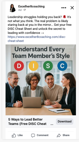
Meta ad: headline 'Understand Every Team Member's Style' above four coloured D, I, S, C circles and a smiling diverse team around a laptop
A / Outcome

"Understand Every Team Member's Style"

Job
Sell the end result: a team that works well together
Carrying layer
Visual. The four D-I-S-C circles are a pattern interrupt and name a specific tool
Result (Meta)
Winner2.91% link CTR / $0.53 CPC / 61% of spend
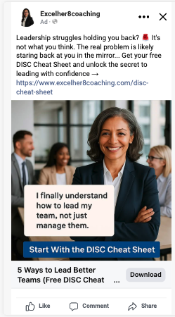
Meta ad: confident woman leader with a quote card 'I finally understand how to lead my team, not just manage them' and a band 'Start With the DISC Cheat Sheet'
B / Identity

"Lead my team, not just manage them"

Job
Let leaders see themselves in her. The quote is illustrative, written for the ad, not a client testimonial
Carrying layer
Text. "Lead, not just manage" is a phrase the audience already uses about themselves
Result (Meta)
1.50% link CTR / $2.14 CPC / 4% of spend
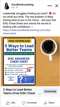
Meta ad: the DISC cheat sheet shown on a tablet next to a coffee cup with a Free Download badge
C / Product

The cheat sheet itself

Job
Make the free offer feel concrete by showing exactly what you get
Carrying layer
Visual. The real product removes the "what am I signing up for?" doubt
Result (Meta)
2.76% link CTR / $1.24 CPC / 35% of spend

With a small budget, the image is the biggest lever on a cold scroll. Testing outcome, identity and product first shows what kind of picture this audience responds to before any money goes into hook rewrites.

Which creative won

The outcome image won on delivery cost.

A's link CTR was close to C's (2.91% vs. 2.76%), but it drew more than twice the total engagement, ran at less than half the CPM, and cost $2.48 per landing page view against C's $12.39. Meta gave it 61% of the budget.

CreativeSpend (AUD)ImpressionsCPMLink CTRAll-clicks CTRCPCLink clicksPage viewsCost / page view
A. Outcome: Team Harmony$497.80 (61%)32,275$15.422.91%6.38%$0.53938201$2.48
C. Product mockup$284.87 (35%)8,289$34.372.76%3.63%$1.2422923$12.39
B. Identity: Lead, Don't Manage$34.31 (4%)1,066$32.191.50%3.00%$2.14161$34.31
Total$821.5941,901$19.612.82%5.75%$0.691,183225$3.65

Meta Ads Manager export, Aug 23 to Nov 29, 2025. Reach 18,851 people, 2.22 average frequency.

Why the outcome image won

It met managers where they already were. They think the problem is their team, the image promised to help with the team, and the copy then turned it around to "look in the mirror". The D-I-S-C circles named a specific tool, so the offer looked concrete.

Meta's auction rewards engagement with cheaper reach, which is why A's CPM was less than half the others.

How I read the other two

C was clicked almost as often as A, but only 10% of its clicks reached a loaded page, against 21% for A, and it cost more than twice as much to show. The product shot answers "what do I get?" before a cold viewer cares, so it fits retargeting better.

B was barely tested: about $34 isn't enough to call it a loser. On a cold scroll, a lone leader with an unnamed quote card looks like every other coaching ad and carries no proof.

How to read this: all three images ran inside one ad and Meta decided how to split the budget, so it wasn't an even-split A/B test. I also don't rank the images by Meta's "leads": they matched landing page views almost exactly for every image (199 vs. 201, 26 vs. 23, 1 vs. 1), which means the pixel fired on page load. Clicks, delivery cost and cost per page view are the honest comparison.
Measurement

Counted on the backend.

I used the email platform's numbers rather than Meta's, because Meta's were off in both directions.

MetricMeta reportedSysteme.io (actual)
Leads228119 confirmed subscribers
Cost per leadA$3.60A$6.90 per confirmed subscriber
Landing page visits225573

Meta's 228 "leads" track its 225 page views almost one for one. So it made leads look about half as expensive as they were, and spent the campaign optimising toward people who opened the page rather than people who signed up. Planning a budget around Meta's A$3.60 would have set the client up to overspend by nearly double.

Lead quality: the subscribers went into a 5-email nurture I wrote. The delivery email opened at 71.31% with a 63.93% click rate, and the sequence averaged 52%+ opens.

Check what the pixel is counting

Fire the Lead event only on the thank-you page, and send confirmed opt-ins back to Meta through the Conversions API, so it optimises toward real subscribers.

Run a defined push

Spend and results were concentrated in the 14 weeks. A low-spend tail after November added no subscribers.

The audience was older than the brief

Meta put 64% of spend on 45 to 64 year olds and 86% on 35 to 64. Under-35s got $32.69 of $821.59. Future creative should cast and speak to experienced, mid-career managers.

Plan on backend numbers

Every headline result here uses the confirmed Systeme.io numbers, not Meta's.

What I'd test next

Round two.

This round tested the image. The next round keeps the best image and tests the angle and format.

  1. Fix the tracking first. Lead event on the thank-you page only, confirmed opt-ins sent through the Conversions API, so every test below is judged on sign-ups.
  2. Even-split re-test of A vs. B. Separate ads, equal budgets, a set period. For B, cast an experienced 45 to 60 leader, swap the illustrative quote for a real, named client testimonial, and judge it after about $300 spend.
  3. Iterate on A. Keep the "team that works well together" image and test different team settings, headline text, or more prominent DISC letters.
  4. Hook variations on A. Three to five new opening lines, each on a different mechanism (curiosity, bold claim, identity call-out), everything else fixed.
  5. New angle, same mechanism. Test the cost of a team that clashes (villain: personality conflict) against the current self-awareness reframe.
  6. C as retargeting. Show the product mockup to page visitors who didn't opt in, where "here's exactly what you get" is the right message.
  7. Video format. A UGC-style clip of a coach holding the cheat sheet and walking through the four styles, to test whether video lowers cost per subscriber.
  8. Carousel. One slide per DISC style, the last slide as the call to download, so viewers get value before they opt in.

Skills shown

  • creative strategy
  • ump / usp development
  • static ad concepting
  • ai image creation
  • ad copywriting
  • creative testing
  • meta ads
  • landing page copy
  • lead magnet positioning
  • email nurture
  • backend attribution
Want this for your offer?

Test the image first.

Send me your offer and your current ads. I'll reply with the three visual jobs I'd test first.